McColl’s
Energising a neighbourhood retailer from the inside out
- Brand Strategy
- Brand Identity
- Design
- Messaging
- Tone of Voice
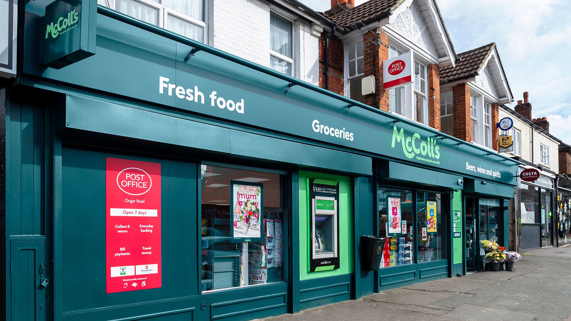
- Store design
- Illustration
- Uniform and launch collateral
We gave McColl’s back its mojo. By reframing the category in a more emotionally powerful way, from local to neighbourly, with the proposition ‘your big-hearted store next door’, our brand strategy leveraged intimacy as a core differentiator.
Owning the rich emotional territory of ‘neighbourly’ reinvigorated everything from the staff experience to store segmentation and product promotion. Best of all we were able to join the dots with the brand’s heritage making it feel relevant again and a key part of the brand’s future.
“ODA brilliantly unlocked the heritage of the brand creating a fresh, warm and engaging identity encompassing the complete customer journey.”
Tim Fairs, Customer Director
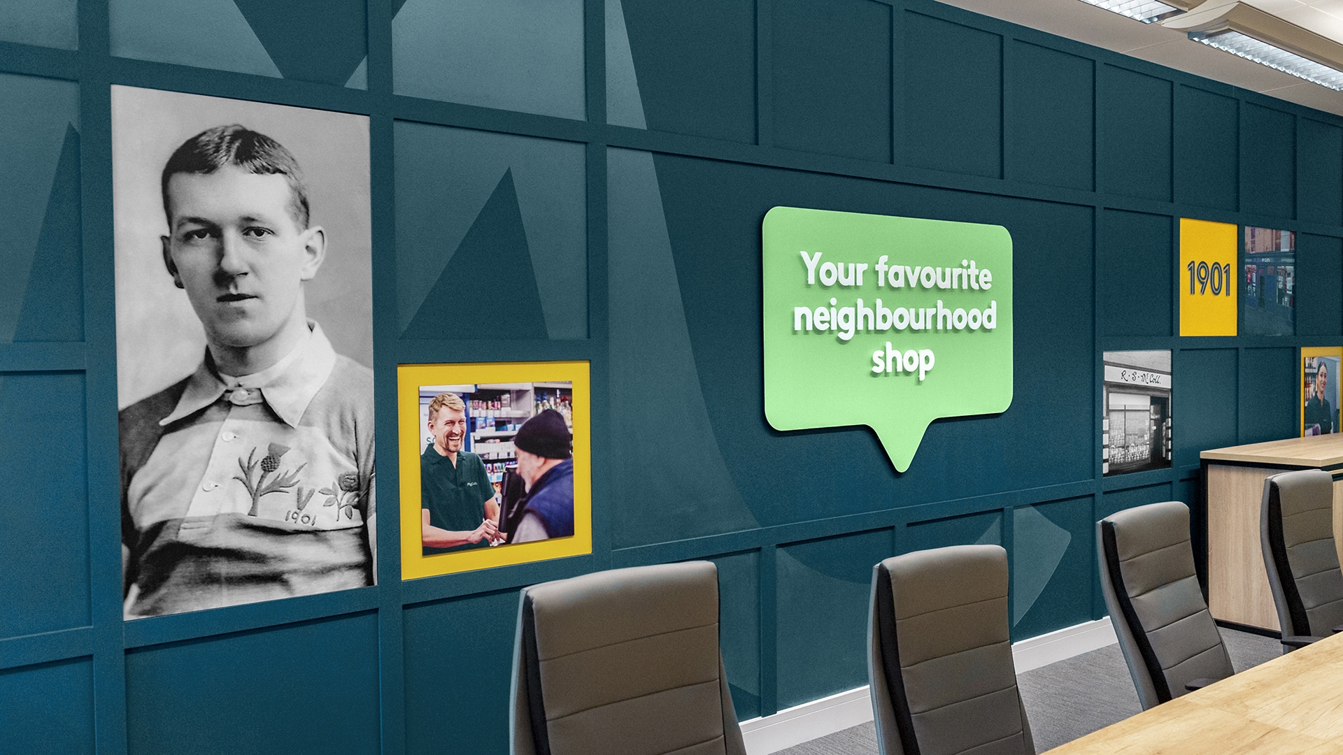
MAKING MCCOLL’S A SOMEBODY
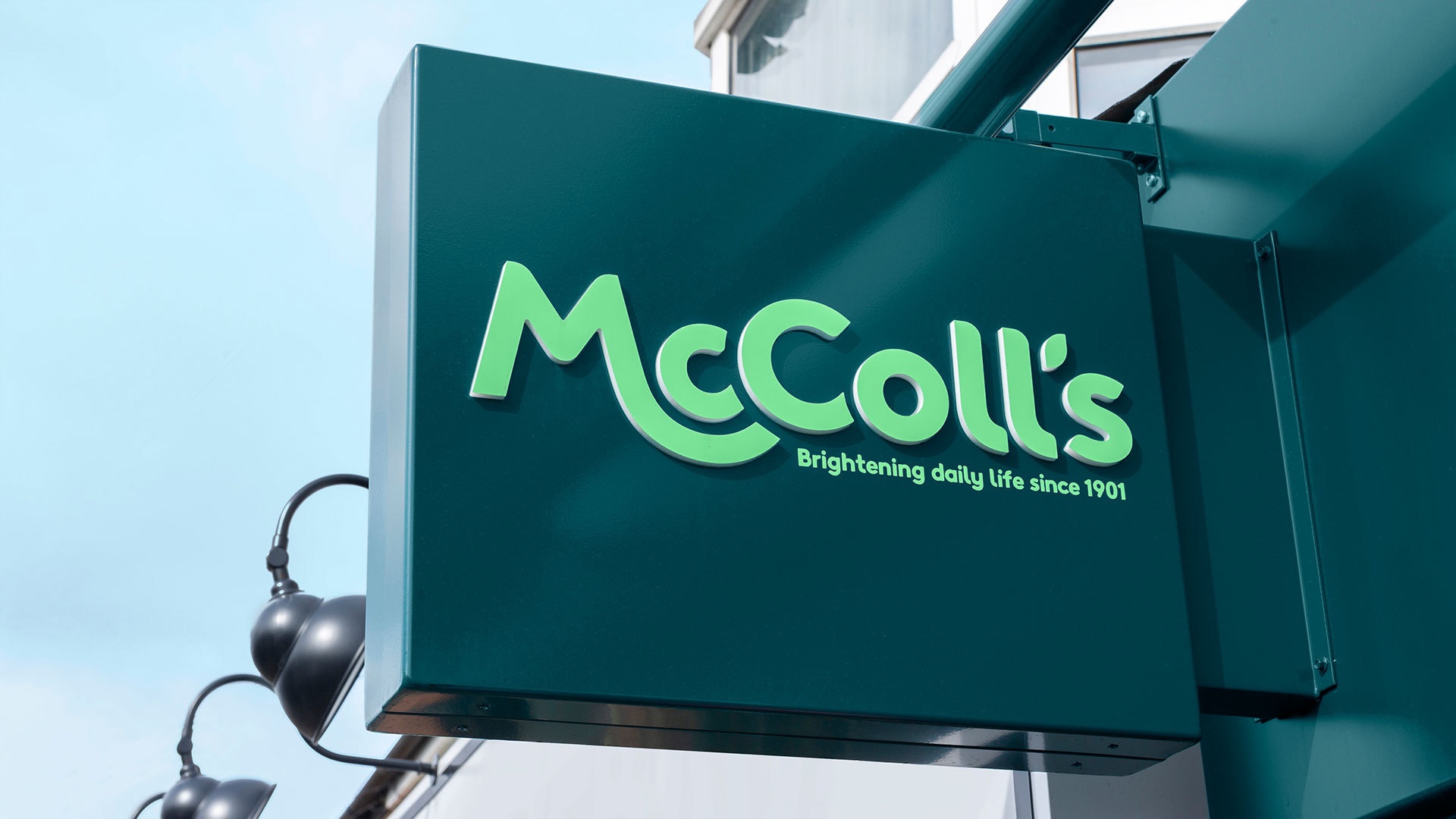
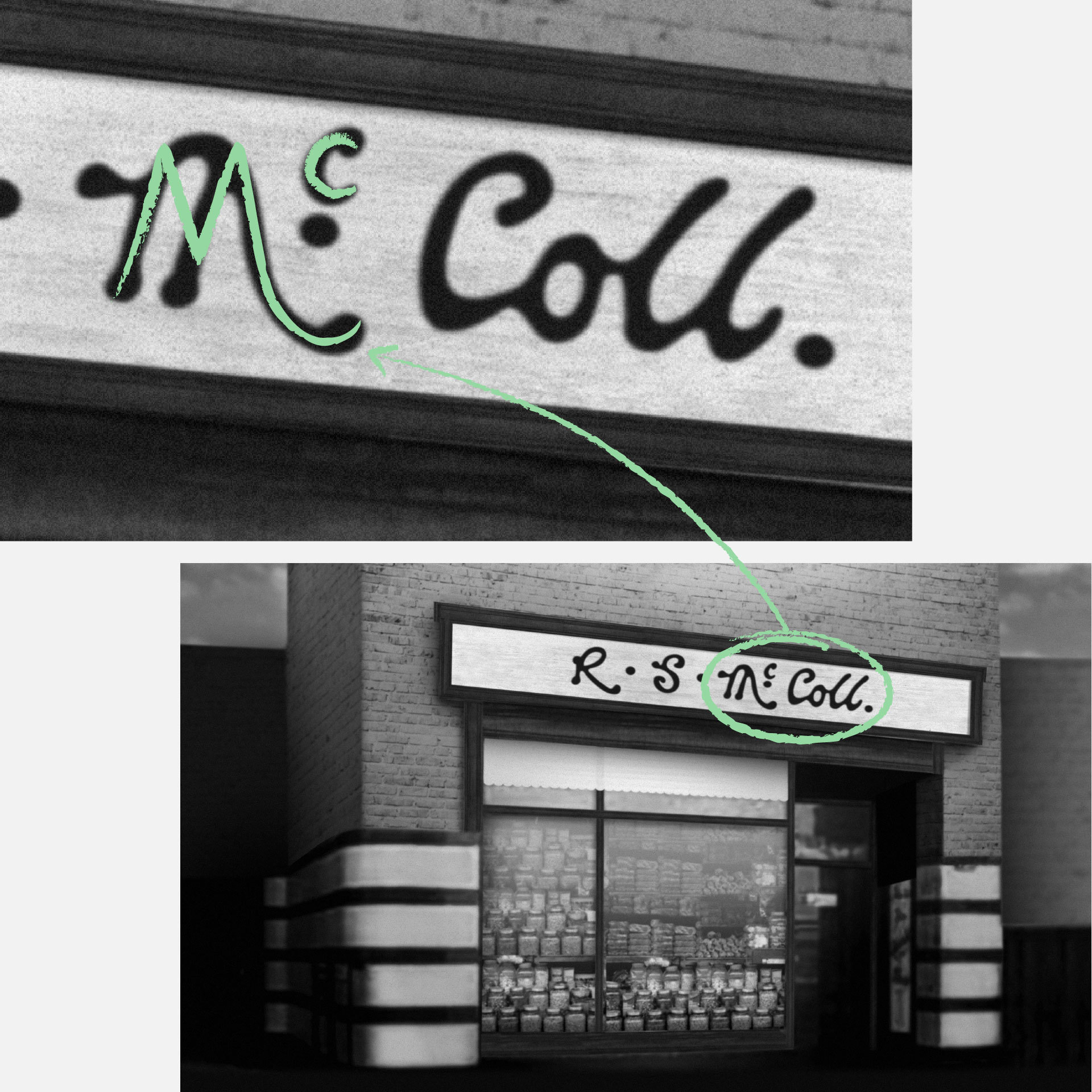
The McColl’s brand felt anonymous and corporate. To introduce familiarity and a human touch we went back to the original founder’s signature and redrew a confident friendly new logotype.

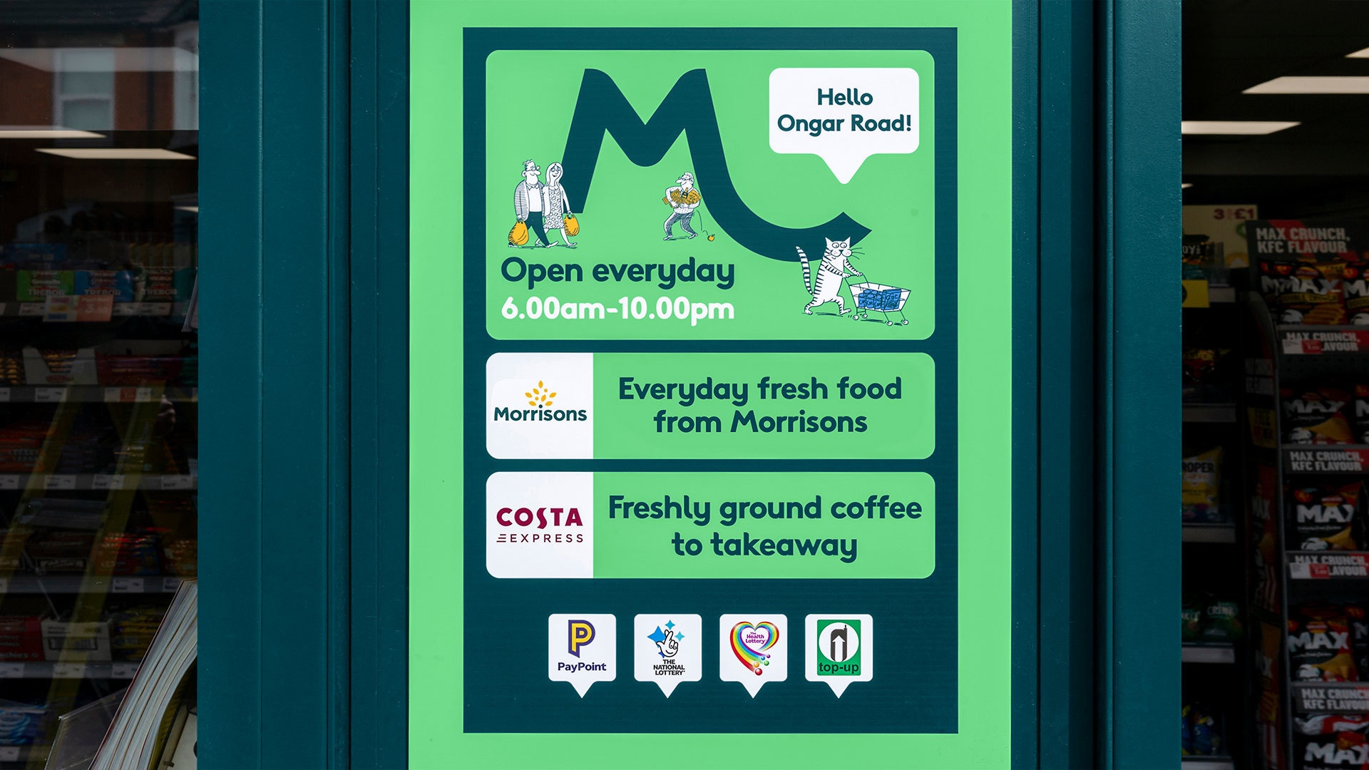
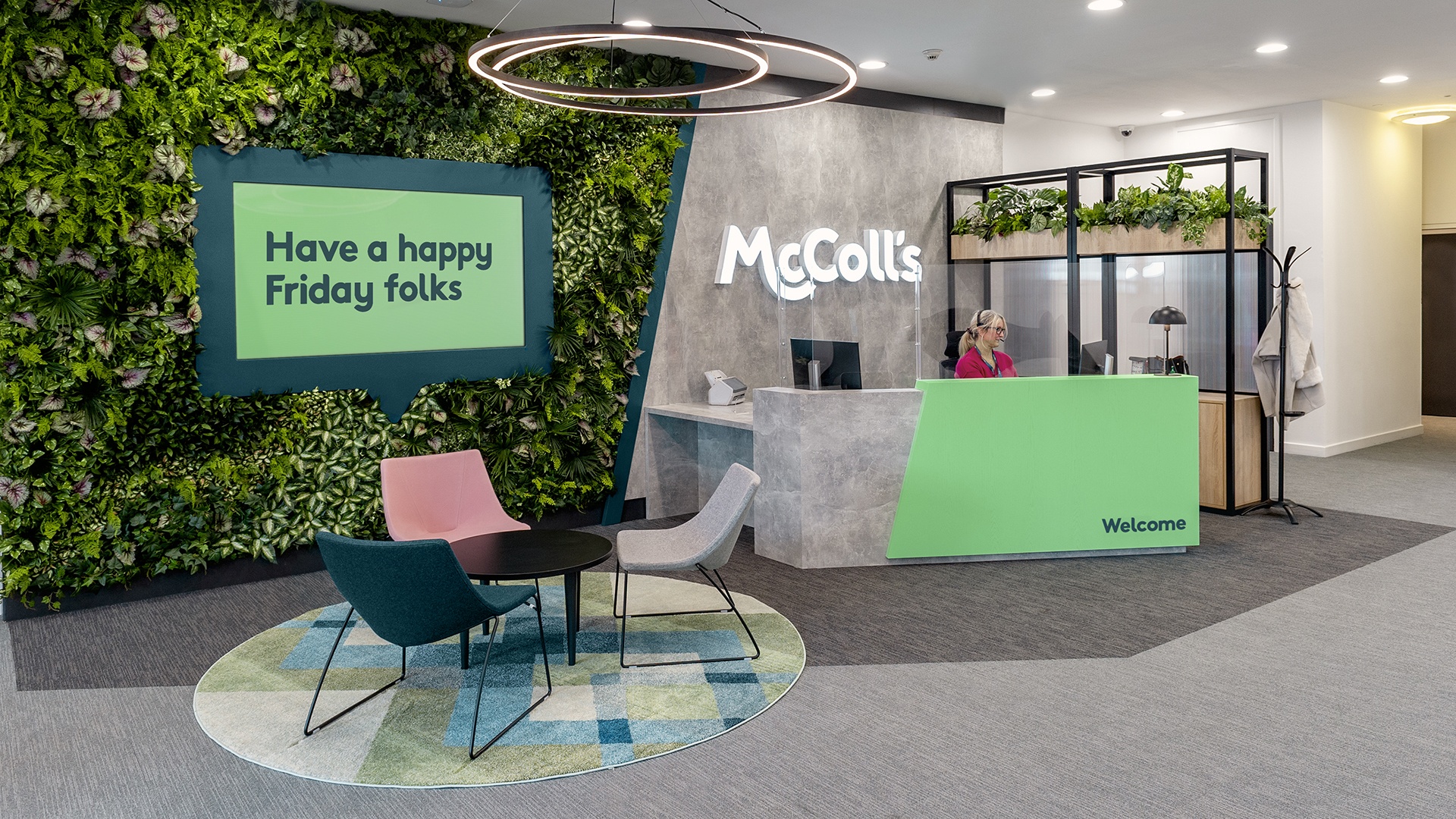
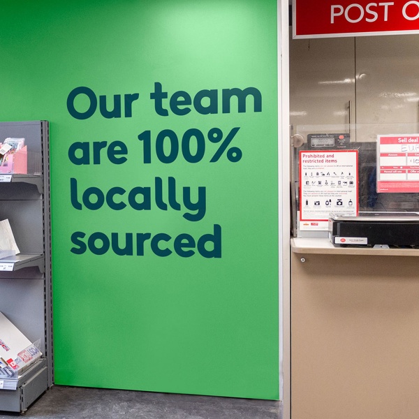
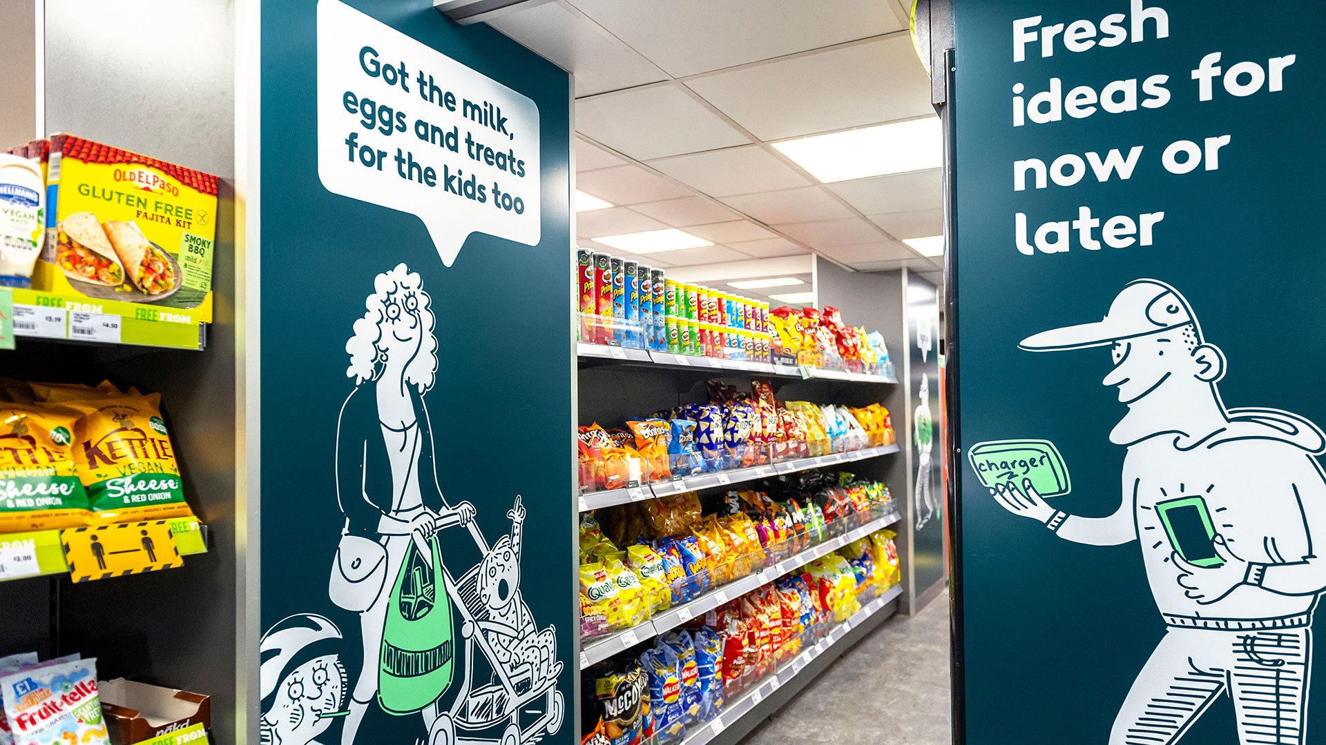
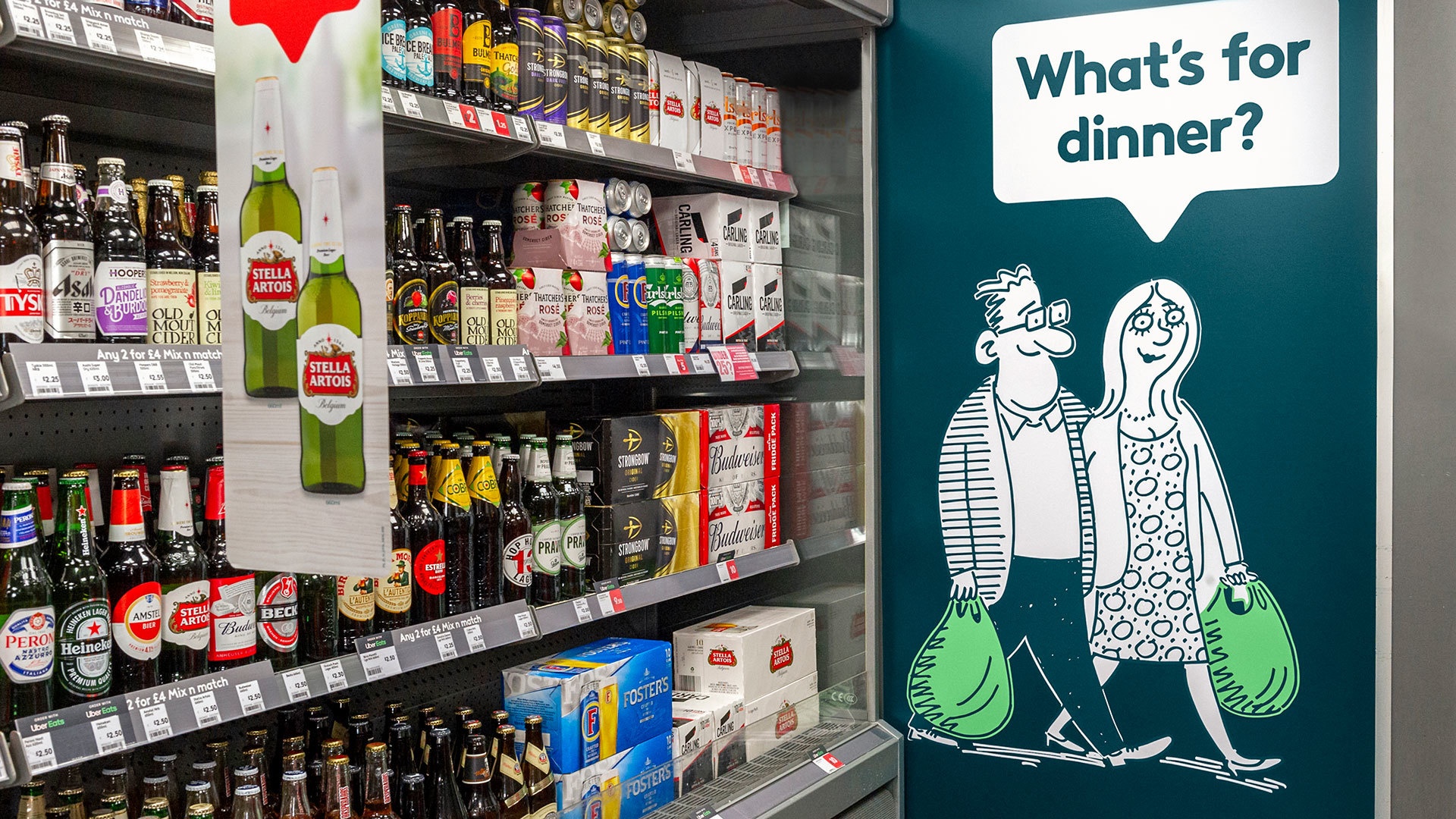
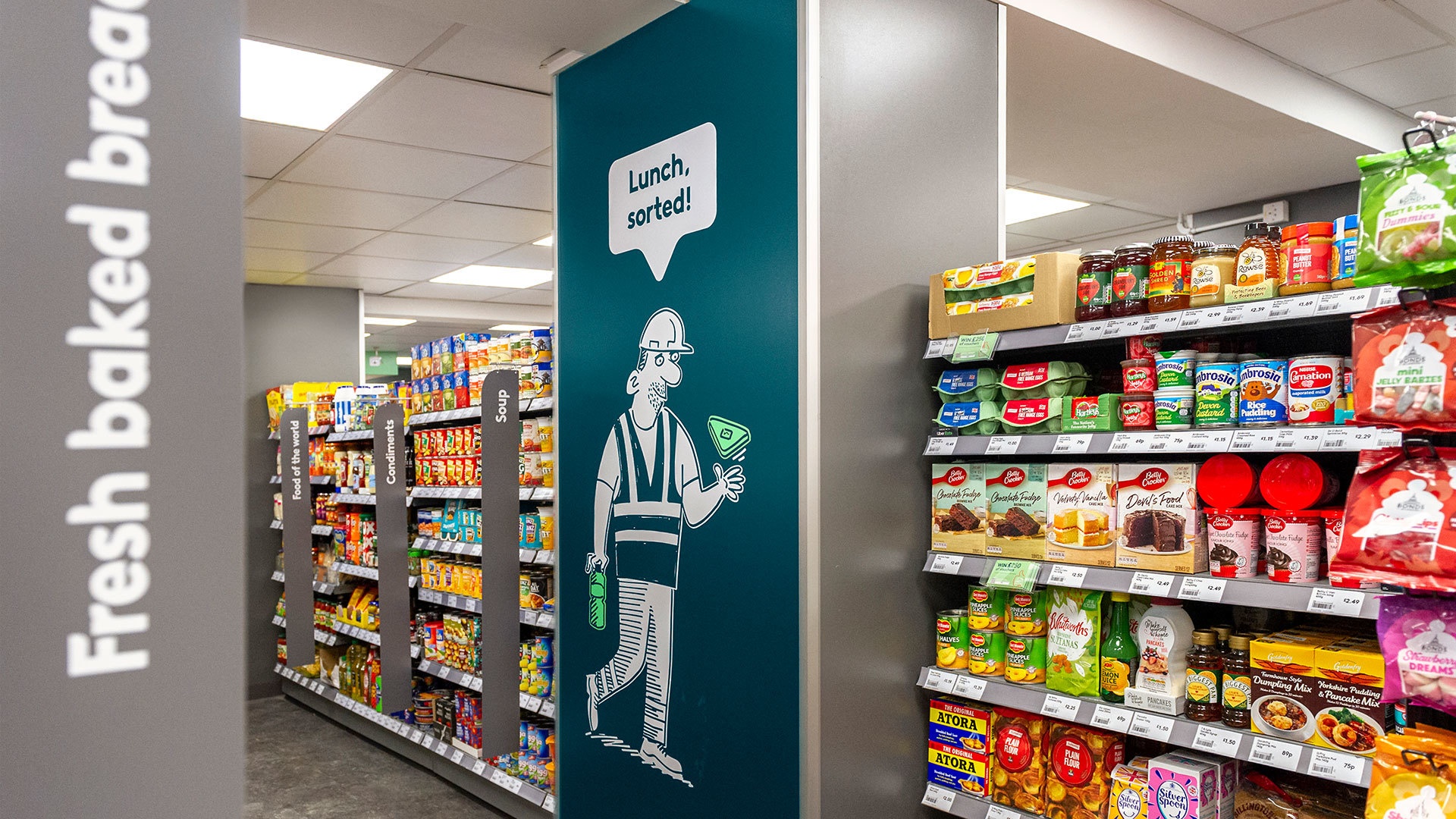
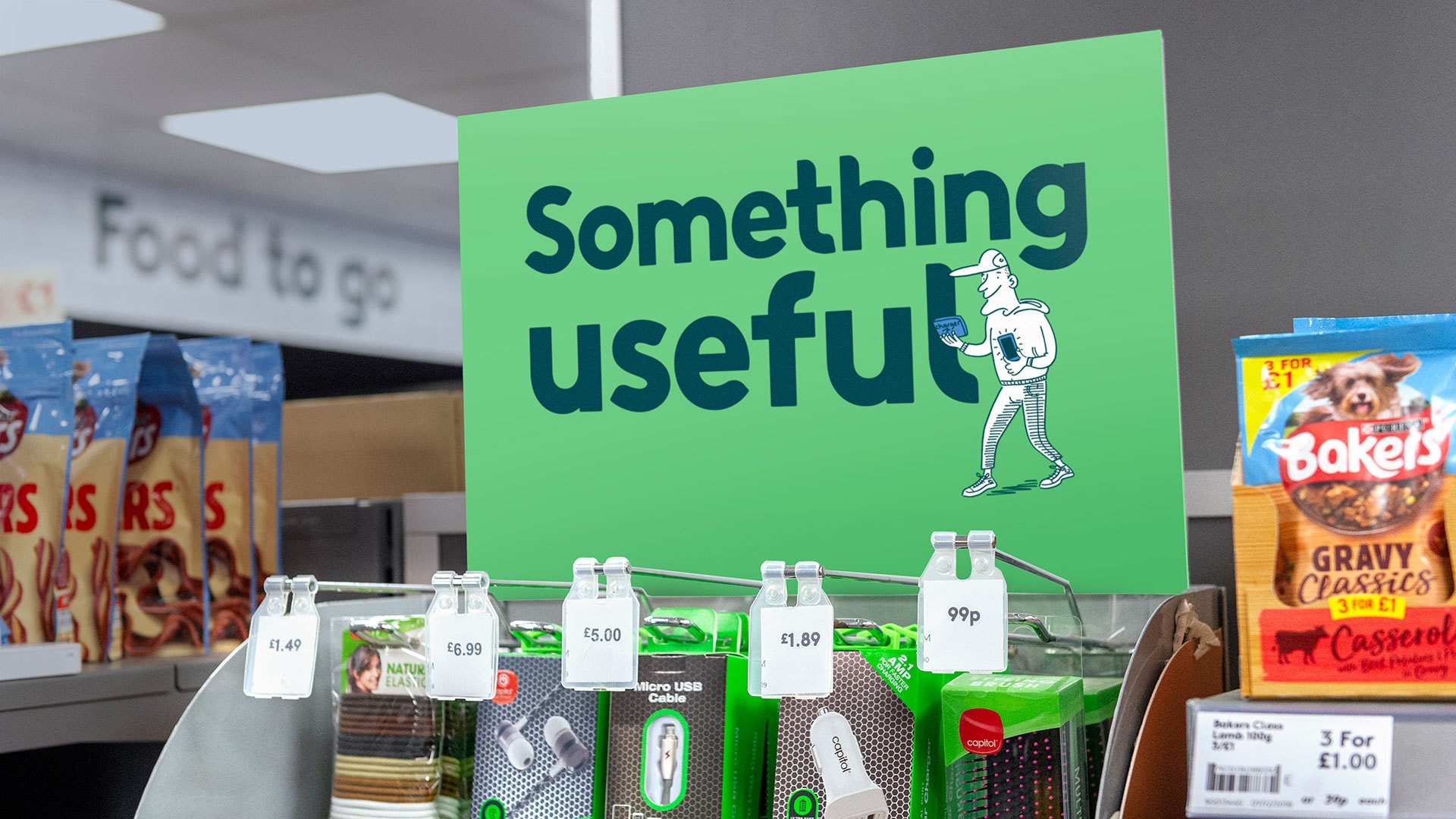
OWNING NEIGHBOURLINESS
Light-hearted banter and liberal use of colloquial tone drove home feelings of intimacy. Written in our bespoke typeface Big Hearted Bold, and using a speech bubble created from the identity, it becomes distinctly McColls.
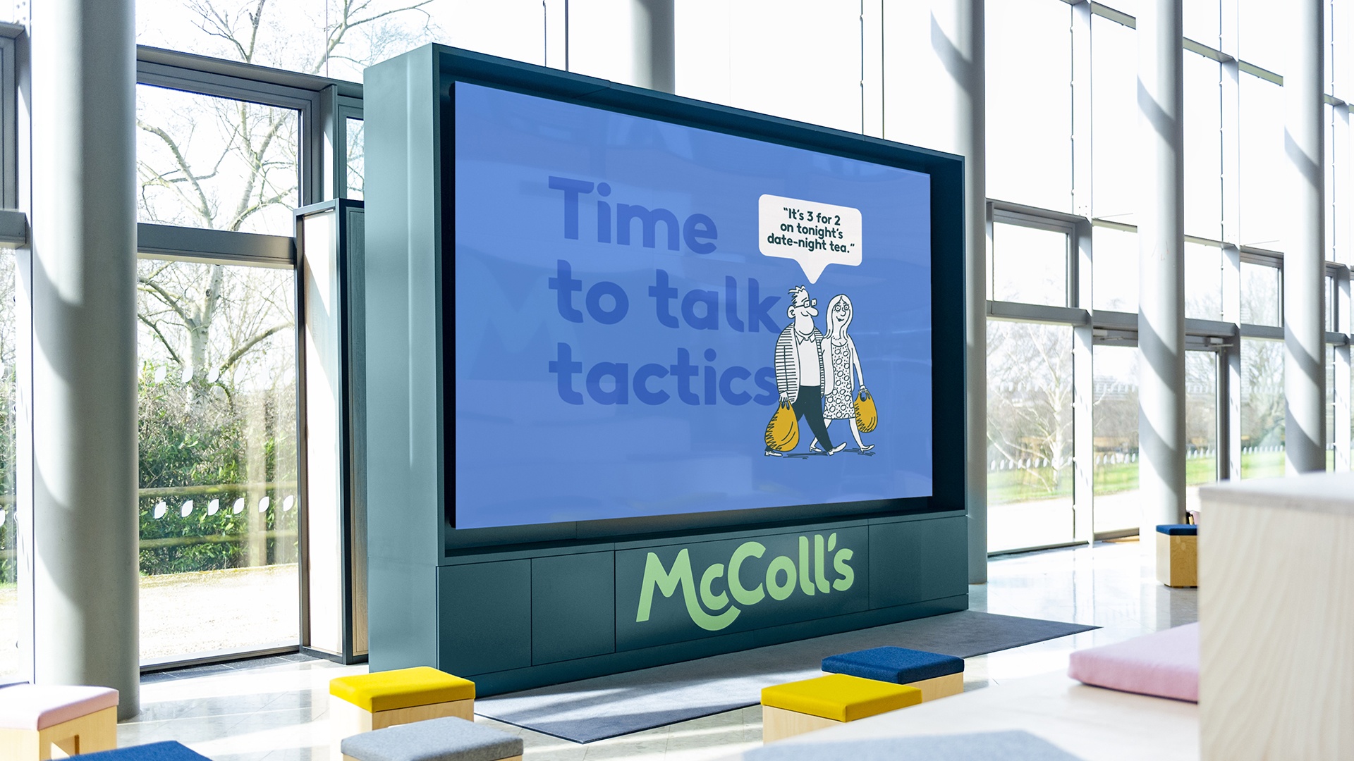
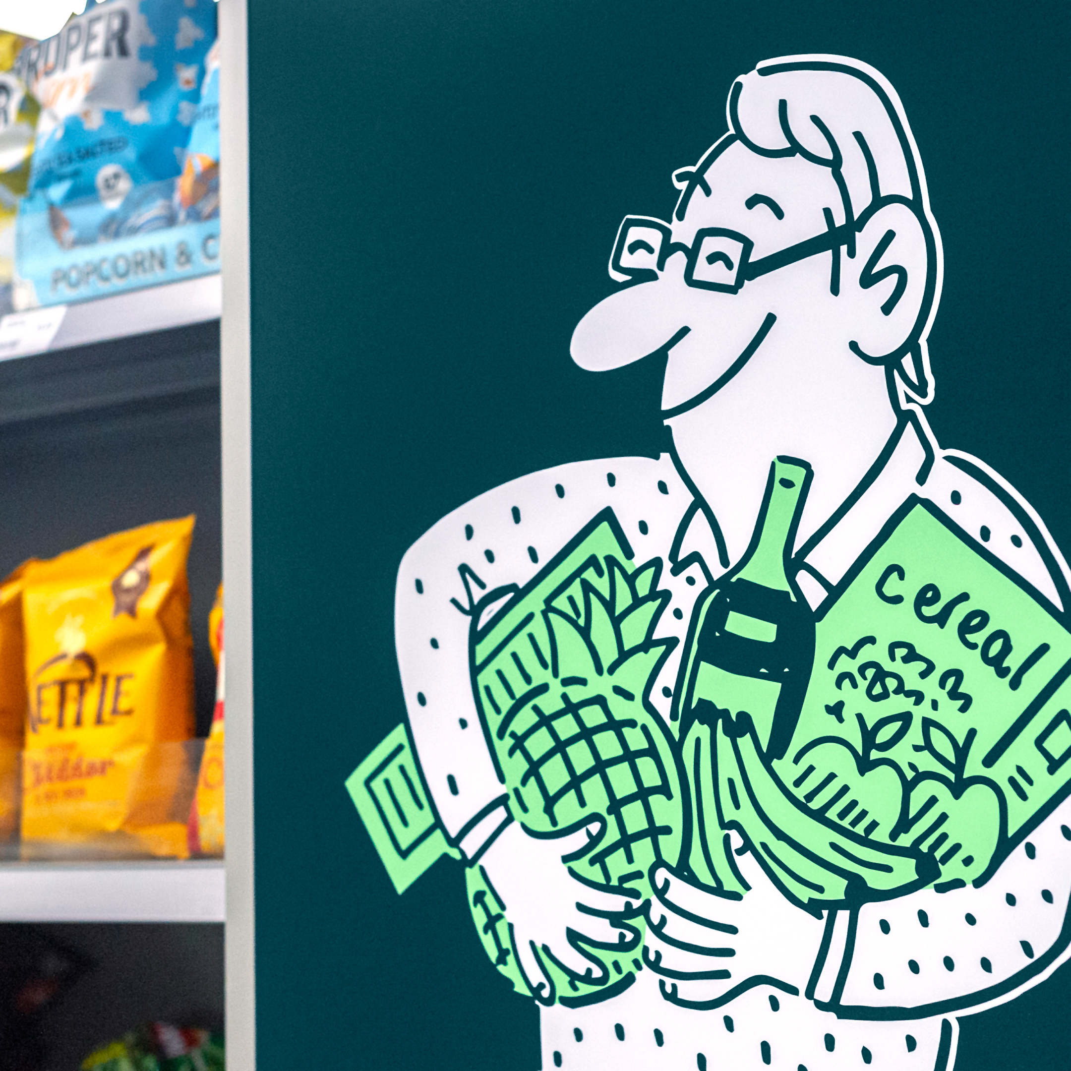
TABLOID FUN
A set of cartoons commissioned from a renowned tabloid cartoonist brings fun and lightness to the identity and nods to the brand’s heritage as a newsagent.
The team are a joy to work with, incredibly talented but always brilliantly pragmatic.
Tim Fairs, Customer Director