Living Streets
Turning an unknown charity into a social movement
- Rebrand
- Brand Strategy
- Brand Identity
- Design
- Copy Writing
- Tone of Voice
- Illustration
- Campaign idea
We started a movement about movement to give Living Streets a spring in their step. Uniting the organisation behind a new purpose helped the brand make great strides in growth and created a 39% increase participation for its iconic behaviour change program.
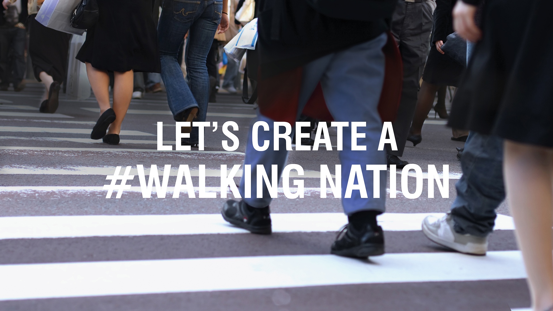
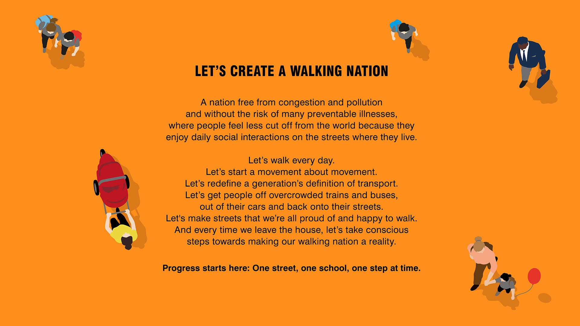
Building on its heritage as The Pedestrian Society, we reignited the organisation with the rallying cry ‘let’s create a walking nation’, reframing an everyday pedestrian act into something transformative for individuals and society.
A bold brand identity and architecture celebrates the brand’s heritage while increasing its relevance with specific consumer and business audiences. The strategy joined up all aspects of the organisation and reshaped and inspired new products, services, and campaigns.
Jump straight to the Impact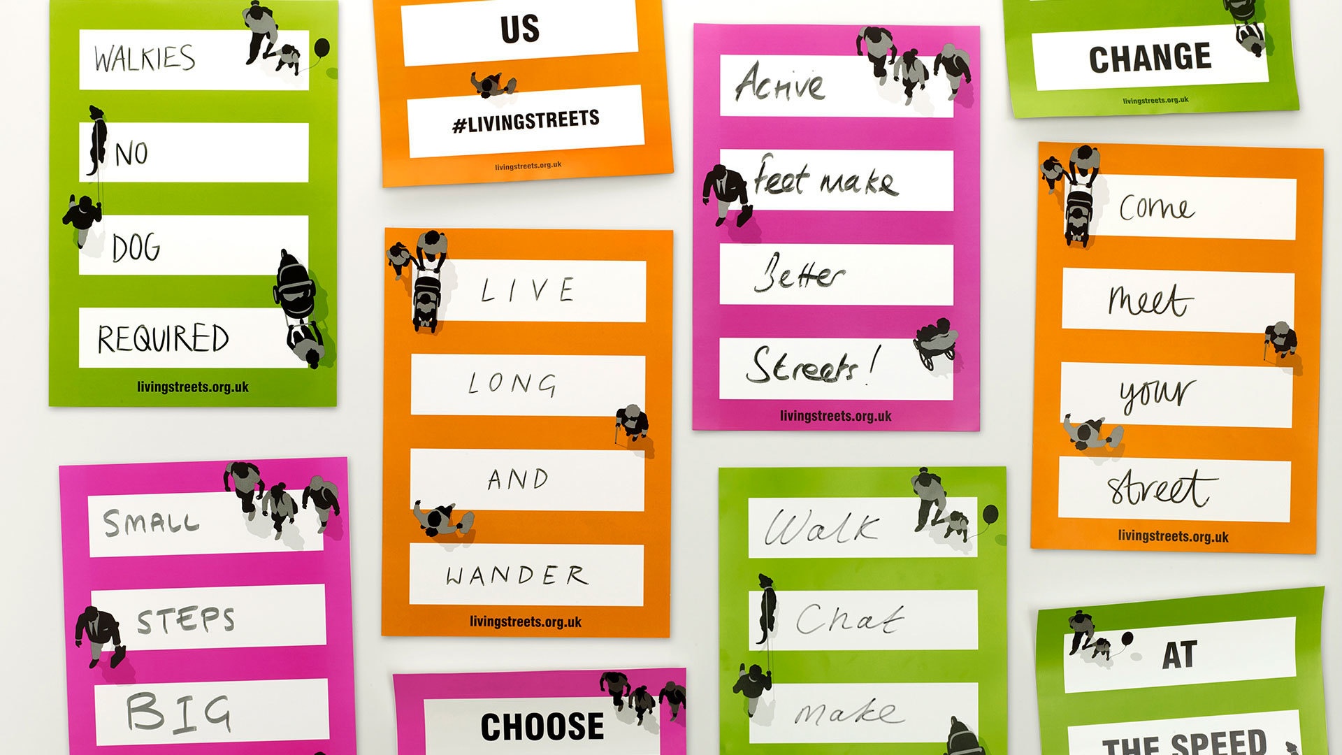
ODA understood our challenge, got right under the skin of our unusual charity, and created the unified voice we so desperately needed.
Annabel Davies, Marketing Director, Living Streets
BRAND IN MOTION
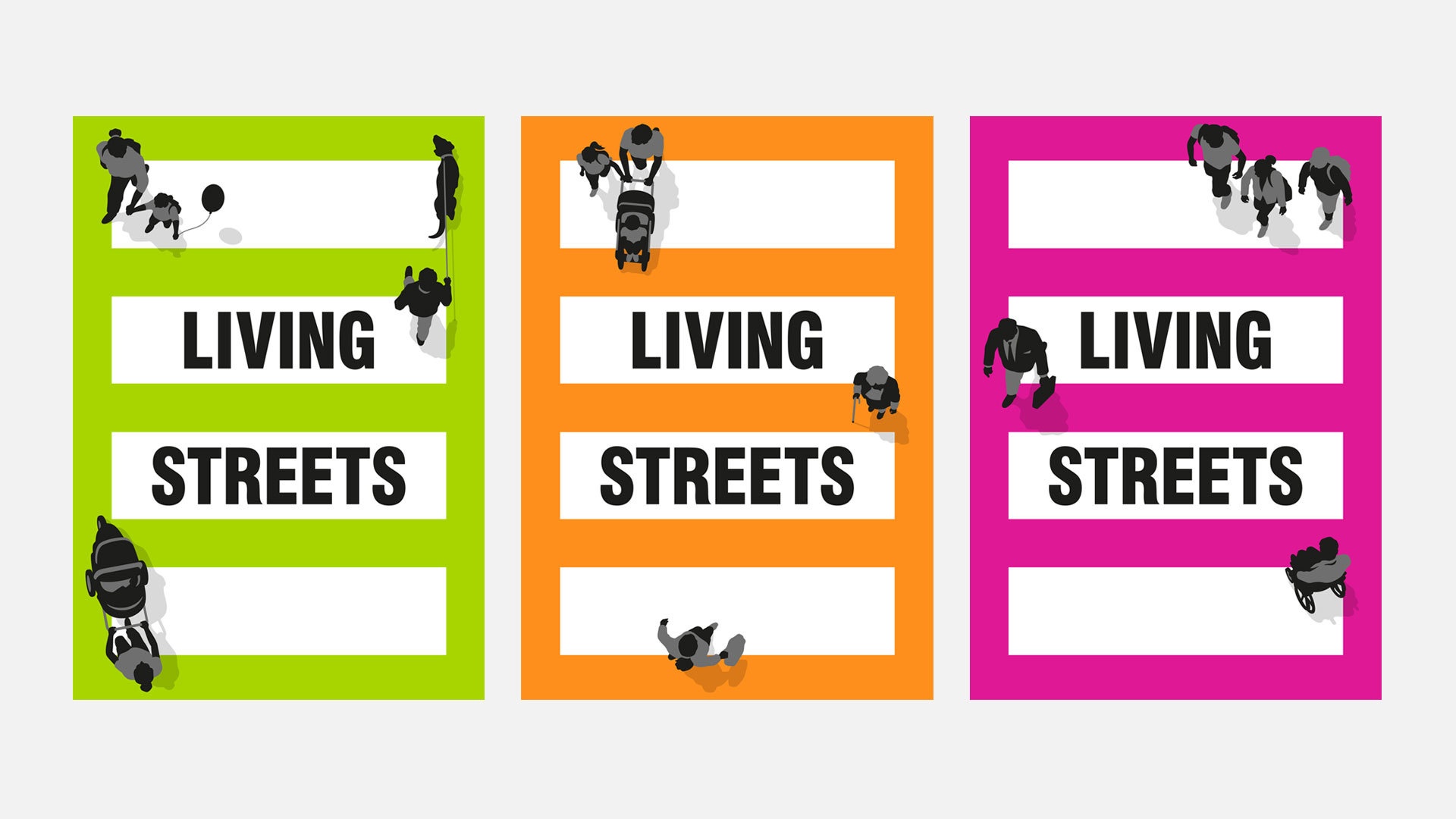
For 90 years, Living Streets has been a beacon for walking. In the early days their campaigning led to the UK’s first zebra crossing. This truth is reflected in a bold new suite of dynamic logos.
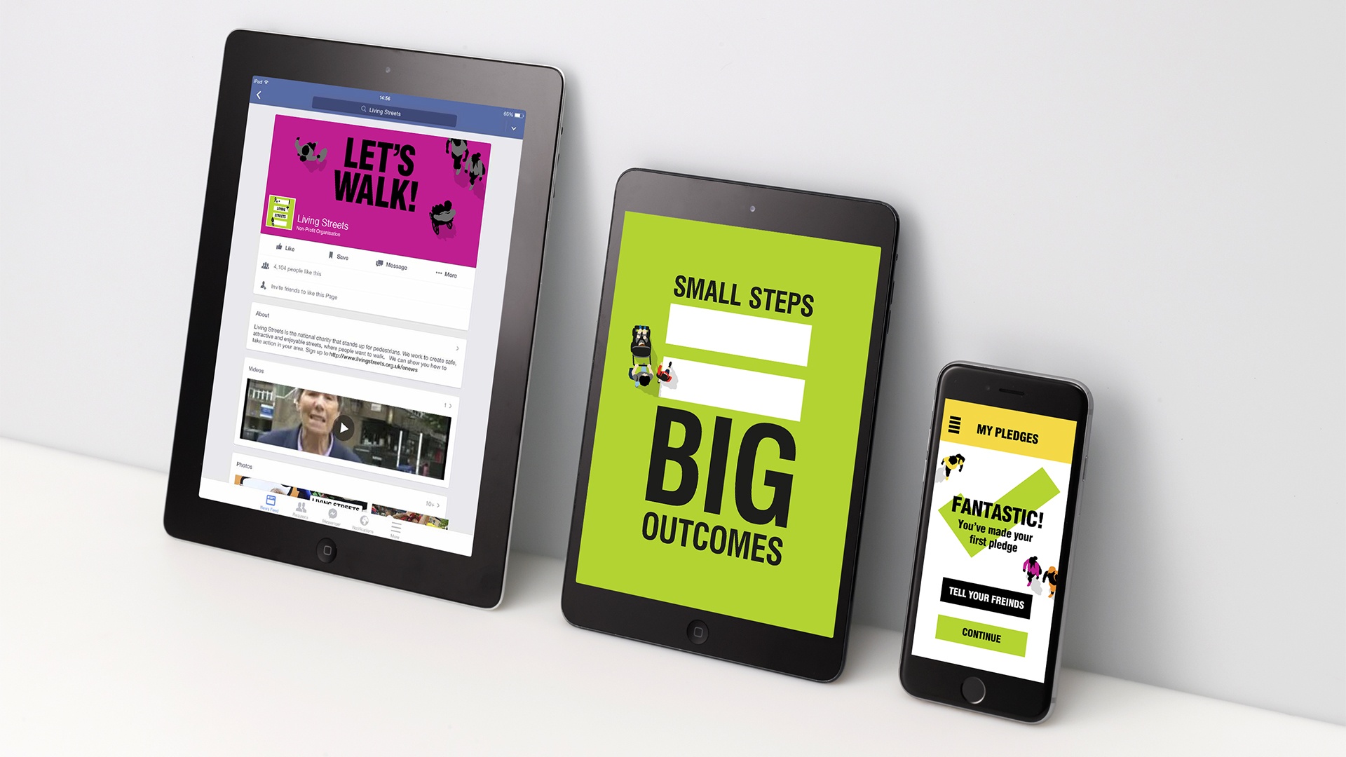
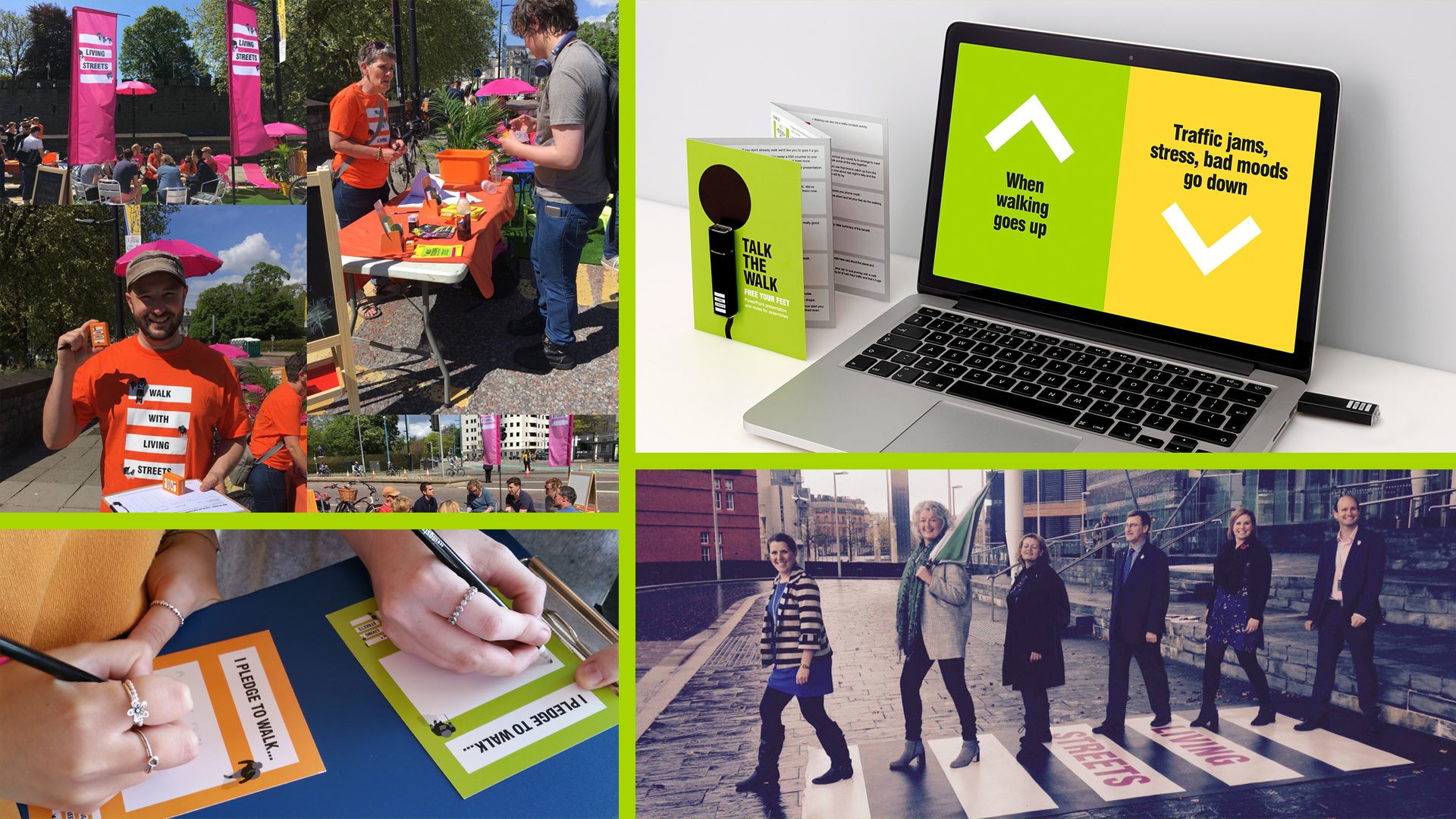
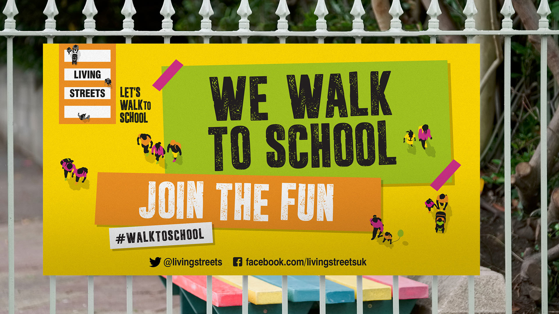
MAKE IT CAMPAIGNABLE!
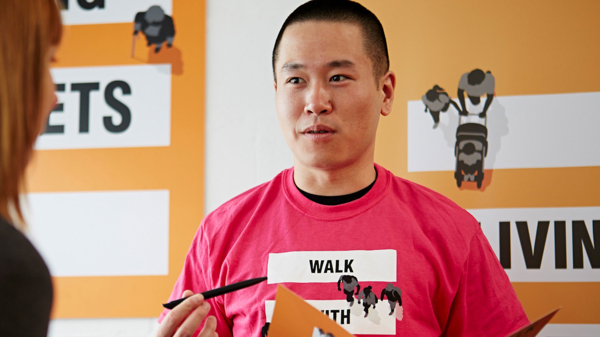
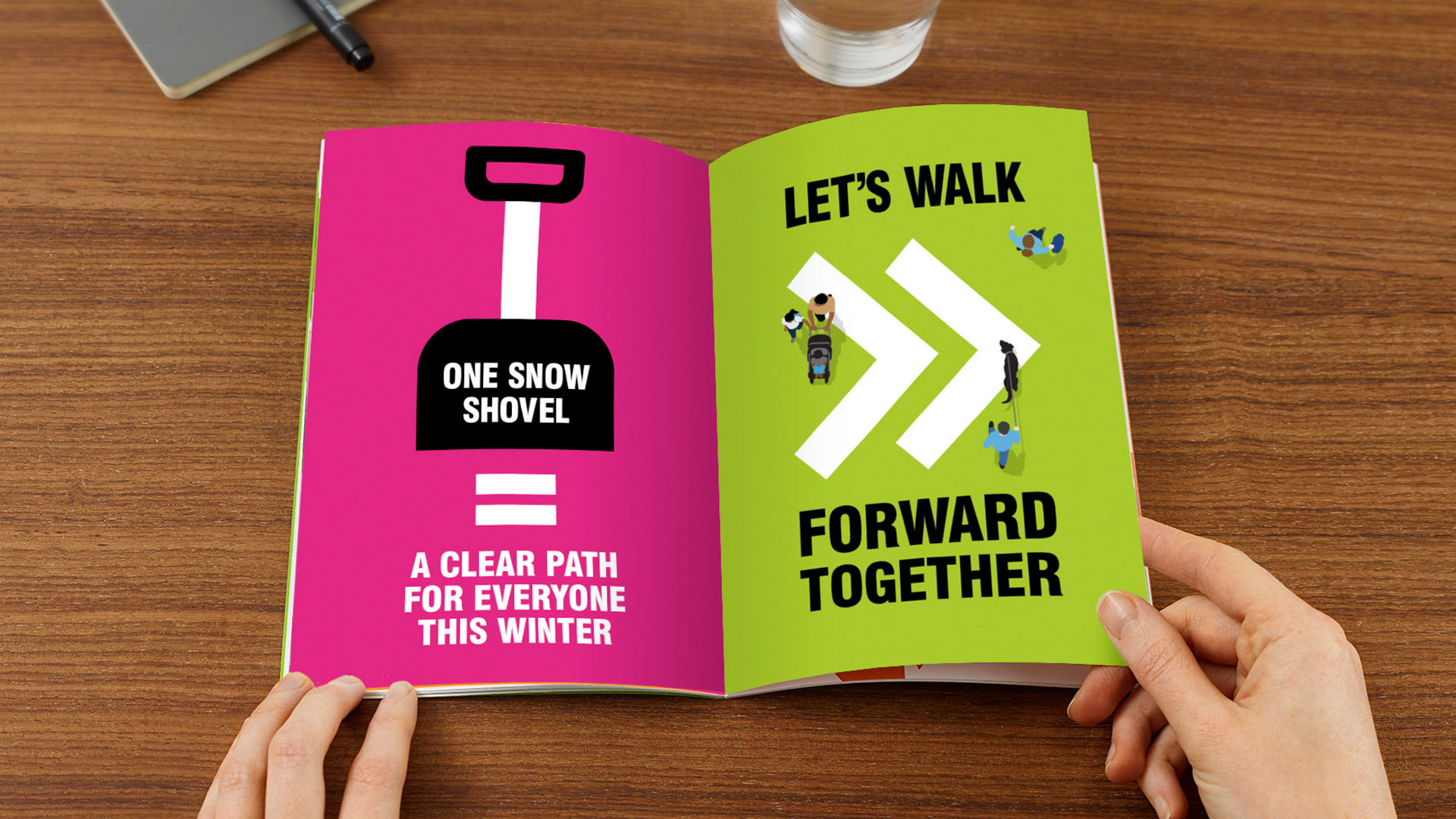
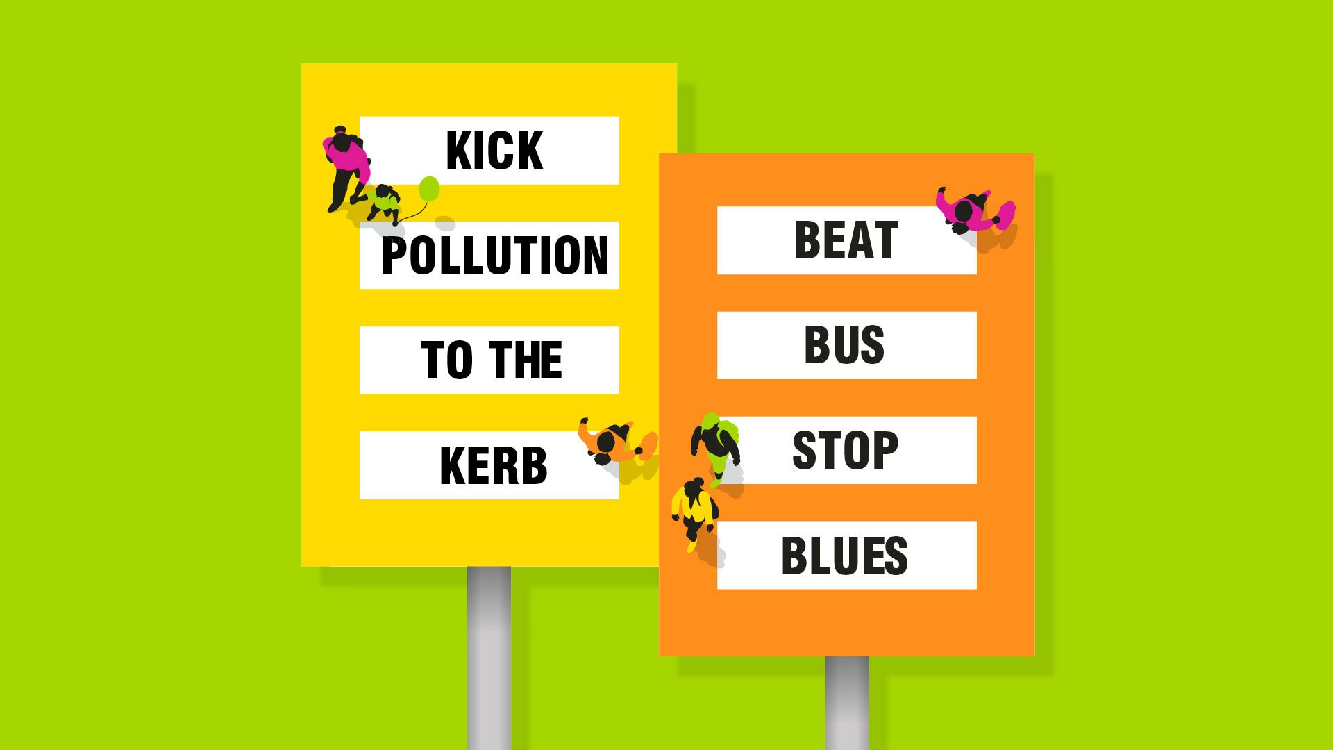
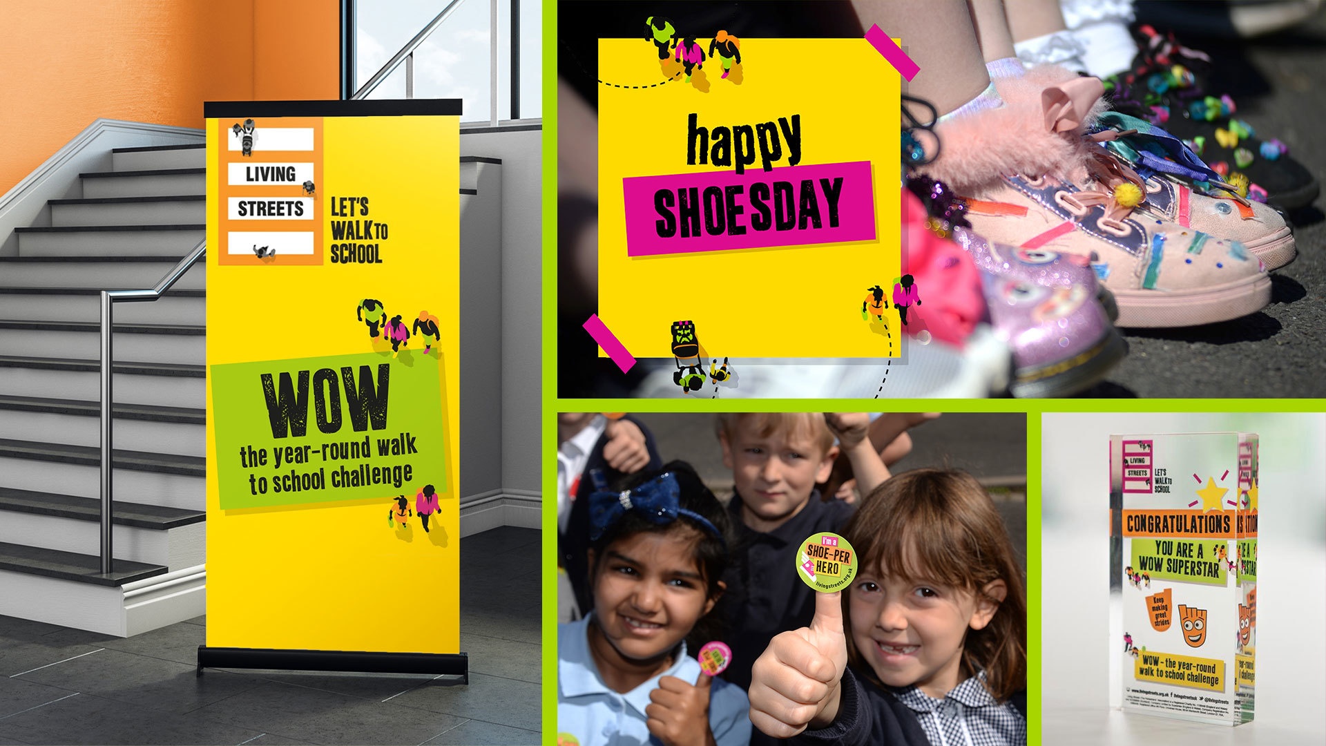
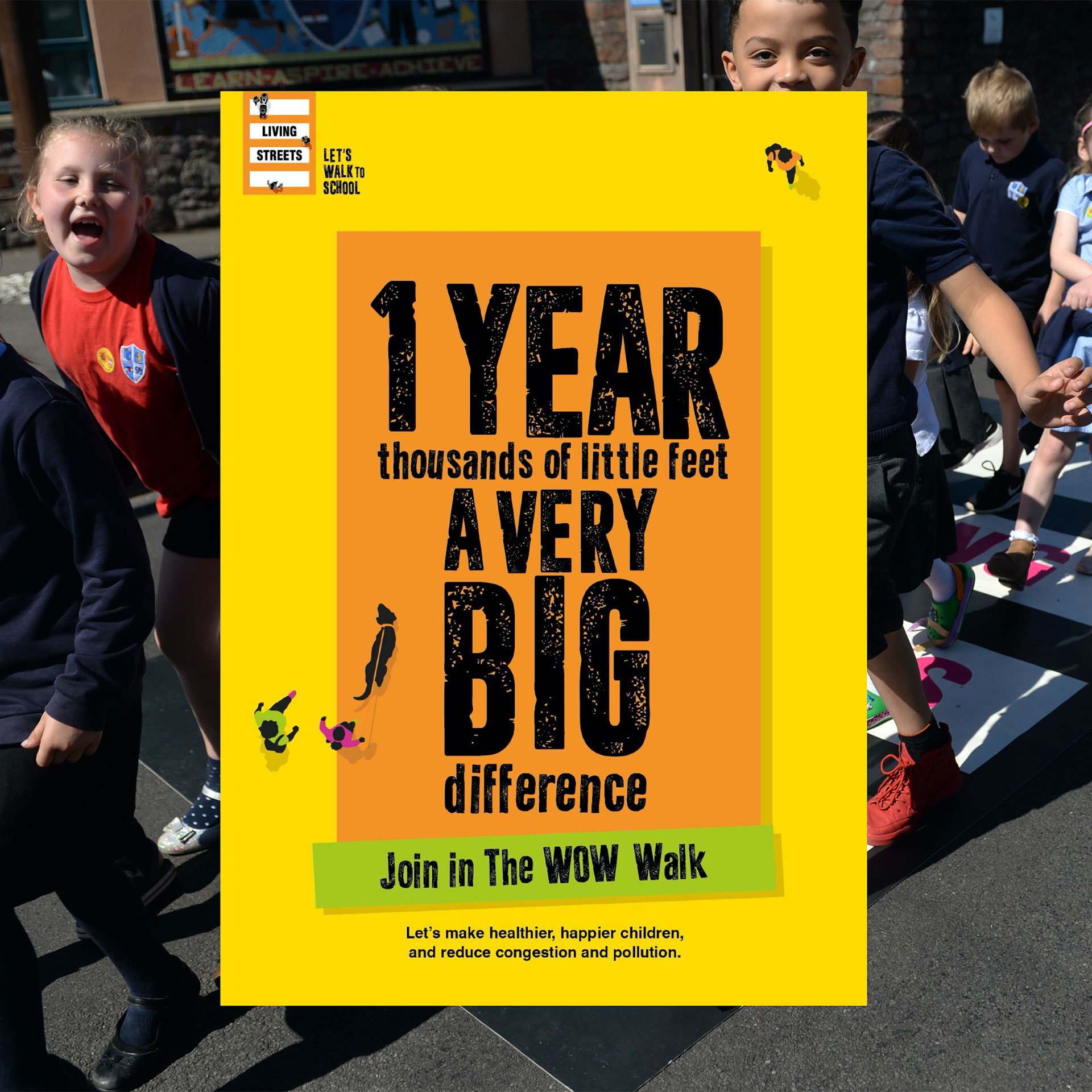
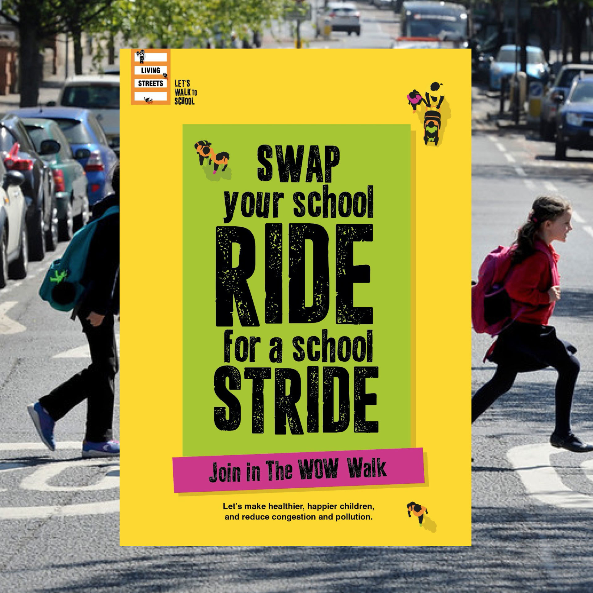
A bold, flexible brand world was designed to be a distinctive visual force perfect for campaign materials.
POSITIVELY UNPEDESTRIAN
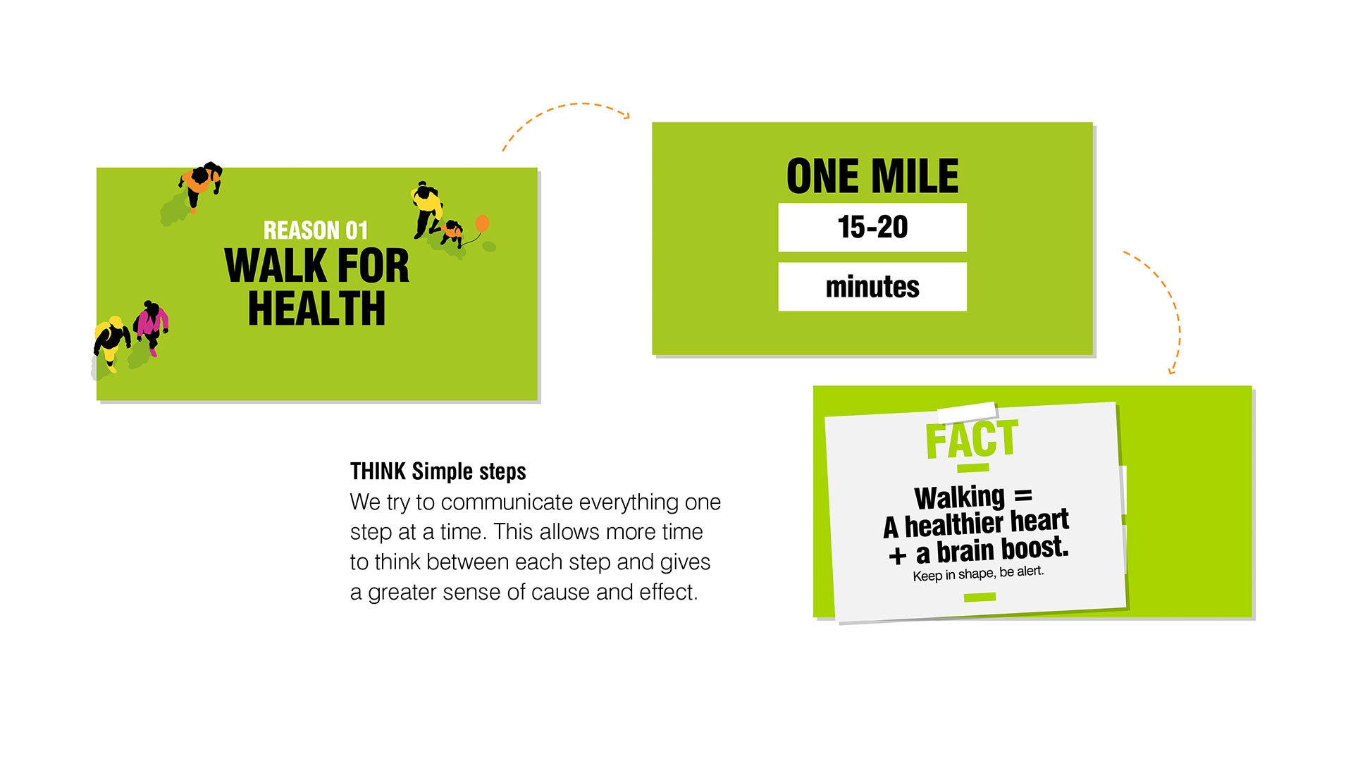
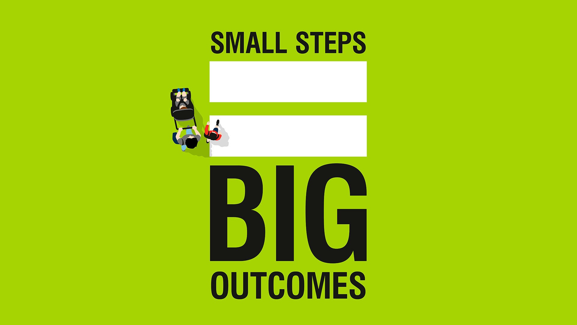
People take walking for granted. A distinct tone of voice made a powerful case for walking based on simple irrefutable benefits, delivered with dynamic copy.

Iconic B2B behaviour change programme was reframed as a year-long walking challenge driving greater engagement and revenues.
IMPACT
-
Increased and diversified income streams
-
39% increase in schools participating in Walk to School
-
Increased public and politician awareness
-
Membership increased with 41% of new members donating