ekko branding features in Transform
ODA develops ‘feel good branding’ for ekko to help tackle climate change
London-based branding agency ODA has developed the design and visual identity for ekko, a new UK fintech app that works with Mastercard to turn the tide on climate change.
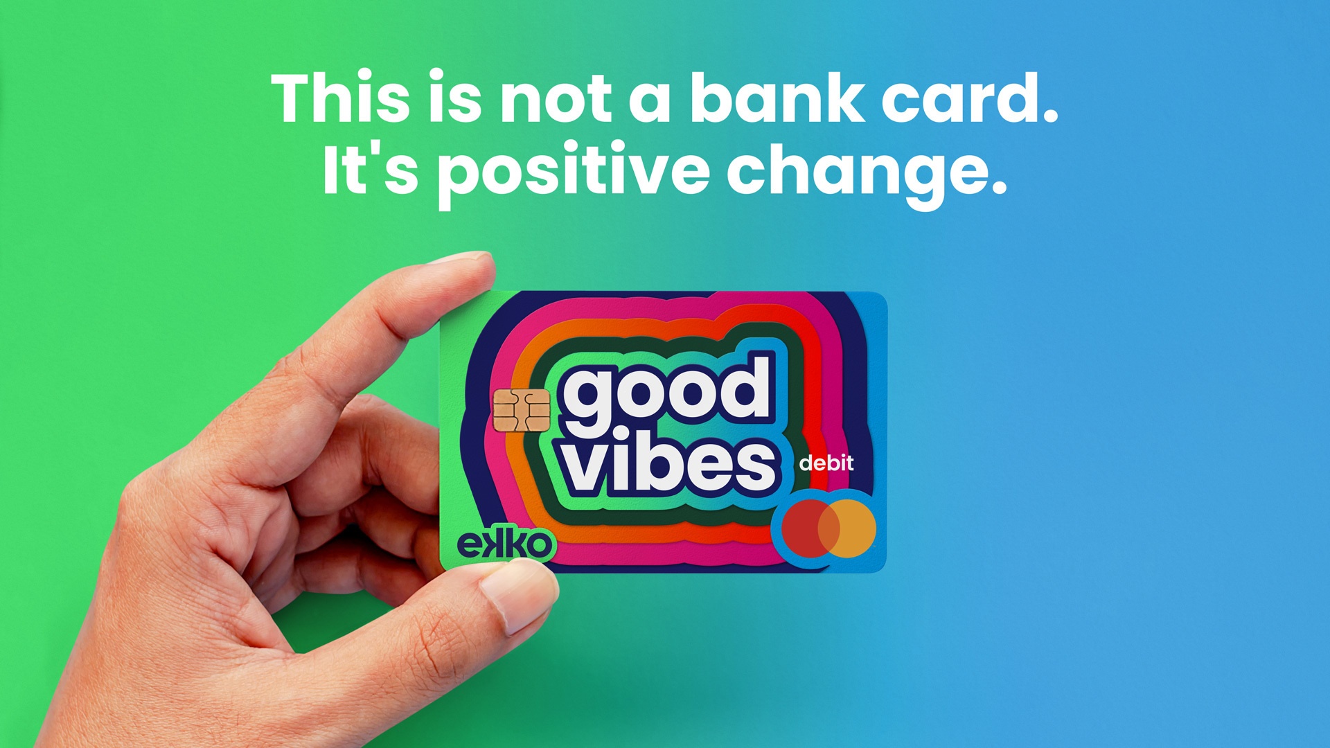
Using the ekko debit card, every 5 transactions a customer makes will pay for one plastic bottle being collected before it enters our oceans and every 50 transactions will pay for a tree to be planted by the customer.
The name ekko was chosen for the duality of the concept and the positive impact of every-day transactions.
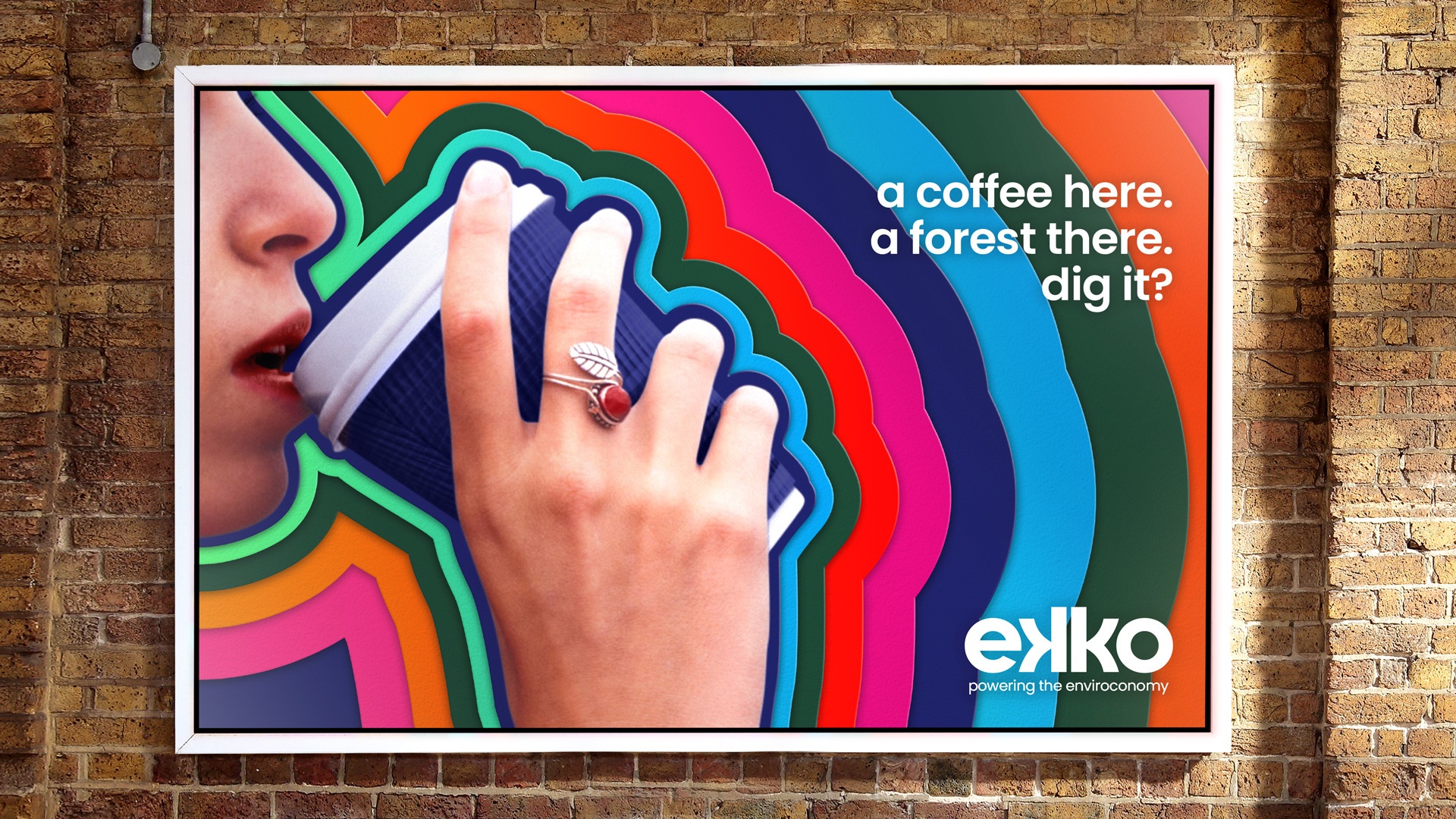
“The brand idea is simple: every transaction has a positive reaction. This became the driver of the brand name and identity. Above all we wanted to create a brand identity that would become a talking point when a customer pulls the card of their wallet. It’s about making change effortless. It’s absolutely not about guilting people into taking action.” says Sarah Westwood, strategy partner at ODA.
The aim was to design ’feel good branding’ that would be the antithesis of the online bank minimalism.
“People are easily switched off brands if they feel too green and worthy. This brand is joyful and doesn’t take itself too seriously. We were inspired by the bright and friendly peace and love idealism of the 60s and 70s and the idea of sending positive vibes out into the world.” says ODA creative director, Grant Willis.
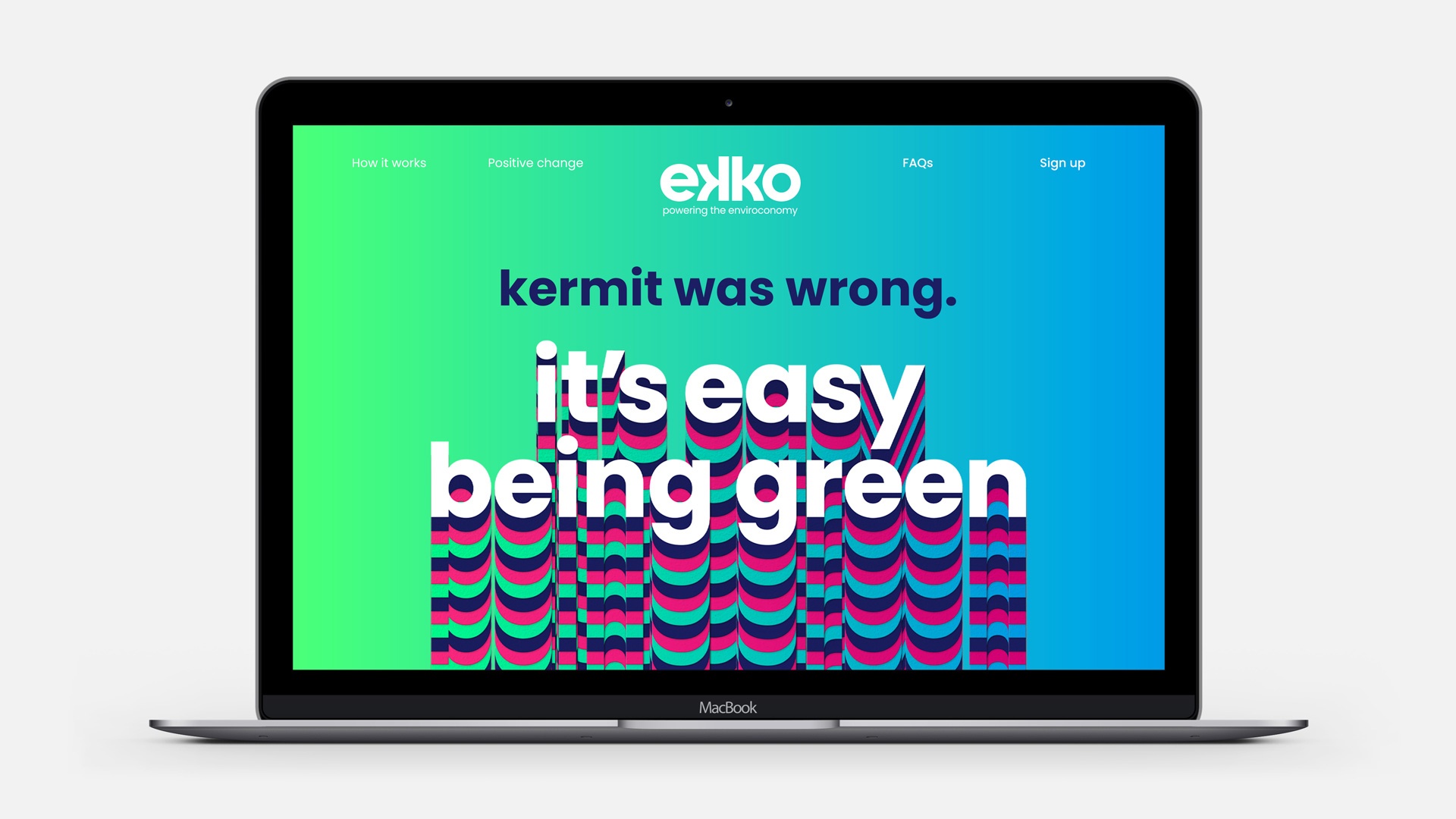
The rounded and lowercase logo is digital friendly and encompasses the idea of the brand in the way it echoes out from the double ‘k’s. The vibrant colour palette aims to bring energy and joy, working well as a sequence of colours in the ekko pattern. The use of emanating echo lines on hero statements adds a sense of dynamism making the brand experience cohesive across other media and channels.
ODA set out to create a distinctive personality with tongue-in-cheek statements like “Kermit was wrong. It is easy being green.” The tone aims to be efficient and effortless but with some little nods to the ‘peace and love’ vibe of the 60s, with the odd sign off like ‘right on’ or ‘dig it?’.
Check out the full article here
23 April, 2021 | Elettra Scrivo